Wednesday 30 April 2014
Tuesday 29 April 2014


Monday 28 April 2014

Friday 11 April 2014
Evalution Question 4-How did you use media technologies in the construction and research, planning and evaluation stages?
During the process of this project I have developed and learnt a lot of skills in which were very useful during the process of producing my media texts. The main programmes that I used for my products were Adobe Photoshop, Adobe Premiere Pro and the photo editing website 'Picmonkey'.
To edit my music video for the main project of my Advanced Portfolio in Media, I used Adobe Premiere
Pro. This was the first time I had ever used the programme and I found it both interesting and challenging. I surprisingly got the hang of how to use it rather quickly. I received a short tutorial from the College's Media technician on the basics of Premiere Pro which involved me importing my footage into the programme so I could begin editing. I started dragging the footage onto the editing line where I would begin placing the each shot in the necessary place which would start to form the video. I found this very simple, I began getting to grips with how to shorten and lengthen the shots to footage to fit within the video. I was struggling for ideas and techniques of editing so I began exploring the effects tools within the programme. I discoved a whole range of editing tools such as tone, contrast, brightness, greyscale, levels etc. It was then when I decided to add the 'Greyscale' effect to represent the 'inner self' side of the character. I then used the 'Auto Tone' and 'Auto Levels' effects on the other footage that wasn't the 'inner self' to represent a more colourful and wild side of her.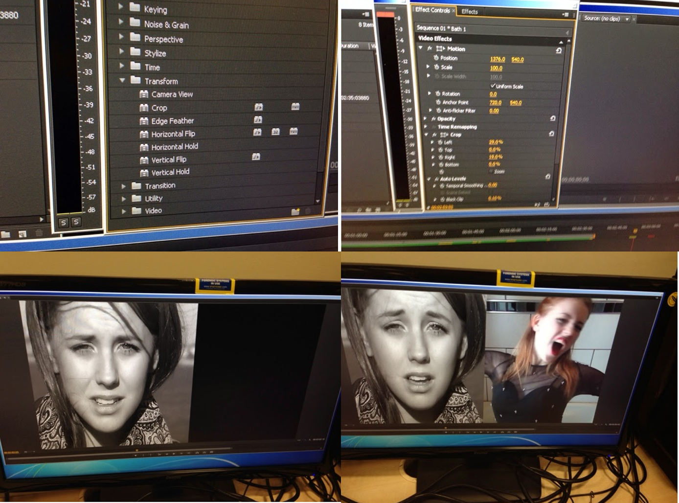 I took inspiration from a class peer nearby who had used a split screen within her video, I spoke to her about it and she suggested that I use it within mine. I realised this would be very helpful to helping the audience to recognise the split personality within the video. To do this I selected the two pieces of footage (one using the 'inner self' side of the character' footage and one using the 'fake front' side of the character footage). I then edited them so they were both singing the exact same section of the song. I then positioned one of the pieces of footage into the section of the video I wanted it to be in. I then put the other piece of footage directly above the other piece in the 'Video 2' row of the editing line. I then added the effect 'Crop' into the video by dragging the effect onto both of the pieces of footage that would later be part of the split screen. I then was control the crop effect in the 'Effect Control' section of the programme. I used the 'Position', 'Left', 'Right', 'Top', 'Bottom' aspects of the control panel to I could alter the split screen and move it to the require place. Once I had positioned both of the pieces of footage in the desired place I then pressed play on the playback section of Adobe Photoshop and checked everything was the way I wanted it to be.
Next up in the ancillary text project was my magazine advertisement, I again used Adobe Photoshop and the photo editing website 'picmonkey'. I began the process by using 'picmonkey', I cropped the image that I selected to a portrait shape which would later form the background of my advertisement. I adjusted the brightness and exposure of the photograph in order to create more colour within the image. I then used the 'Tranquil', 'Dusk' and 'Boost' tool in order to create more of a browny-red colour on the picture. I would normally have edited the flaws within the photograph and then added lipstick and other makeup tools onto the image, however this was unnecessary. I then opened up Adobe Photoshop and began the further editing to my magazine advertisement. I then used the black and white/greyscale in order to make the link between the advertisement and the music video. I then utilised the tool in order to adjust the contrast and exposure of the filter. I then opened up Microsoft Powerpoint in order to create a red shape that would take up the bottom of the advertisement. I then copied and pasted the shape into Adobe Photoshop and then adjusted the size and positioning to the correct size and place. I then used Microsoft Powerpoint to create the shape again but in black to go next to the red shape on the advertisement. I then added this into Photoshop and then adjusted the size and moved it to the correct place on the advertisement. I then added the album front cover onto the page so I could have this in the bottom right side of the poster as this is an convention of this genre (to include the front cover on the advertisement). After this, I adjusted the size and positioned the cover on top of the black shape that was at the bottom of the page. Next up was adding the necessary logos to the advertisement. These included the record label's logo (Parlophone), the parental advisory logo, and the social media logos (Facebook and Twitter). I added all of these to Photoshop and then adjusted the size and moved them on top of the black shape underneath the album cover. It was then time to add the large text to the advertisement, I started by adding the 'THE NEW ALBUM' text to the page. This was written in the 'Agency FB' font that I have used throughout the project, I readjusted the size and changed the colour to black to make it match the running colour scheme of the entire project. The next piece of text was 'I LOVE IT' (the album title), I wrote the text in the same font as the last, I then altered the colour to red (to match the colour scheme) and then readjusted the size and placed it in the correct position. The final piece of the large text was 'OUT 14.04.14' I adjusted the colour to black, increased the size and then moved it to the correct place just above the image of the front cover. I then began adding details of the UK tour dates. I started this by adding the title 'UK TOUR DATES 2014!' I made the 'UK TOUR' part of the text white to make that stand out to the naked eye. After that, I began adding the tour information, this included the venue and the performance dates. All of the information was in the font 'Agency FB' with the venue information coloured in white and the performance dates in black. I did this for each venue and date on the tour until I had completed. Once I had filled the red shape with tour information my magazine advertisement was complete.
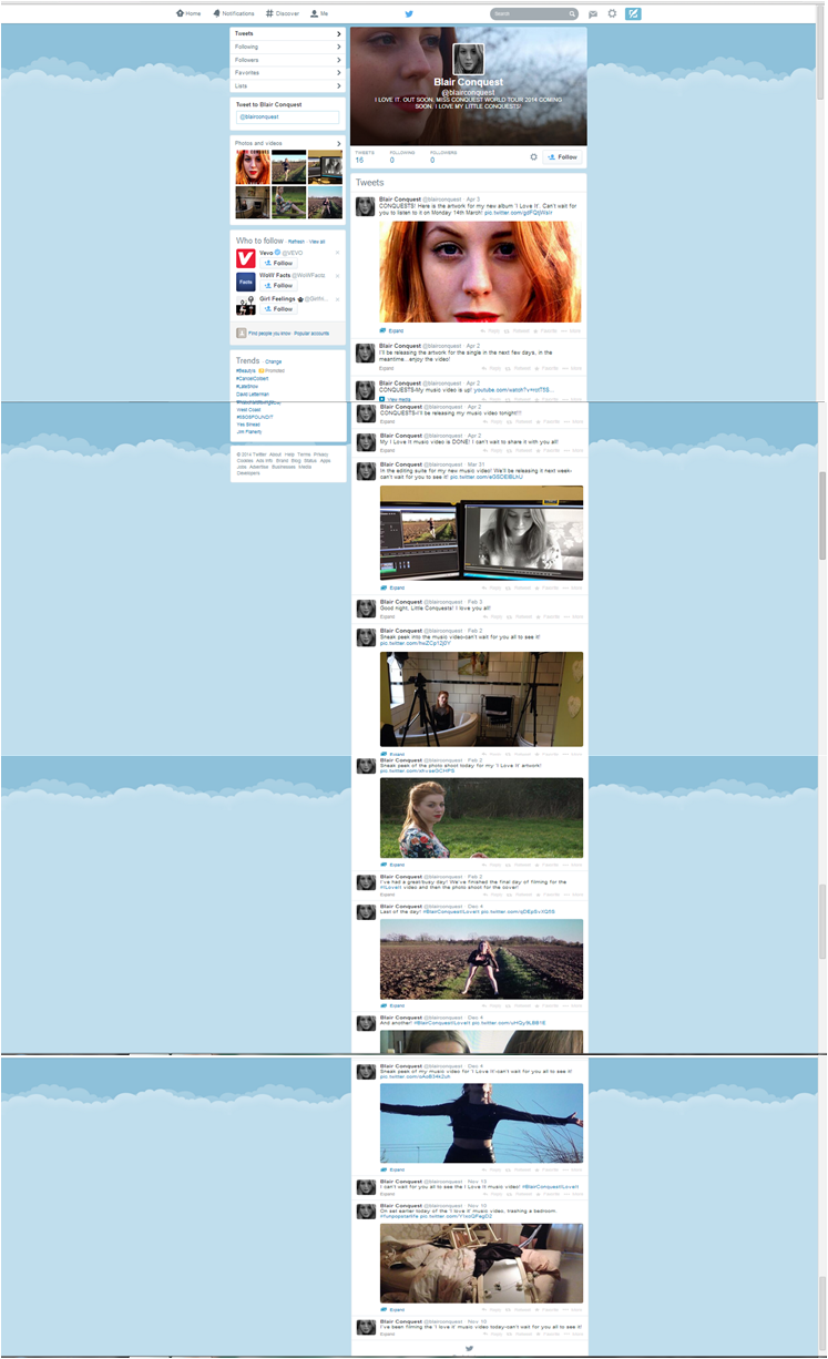 Another media technology I used throughout the process of this project was social networking website, Twitter. I used the website in order to tweet from it as if I was my artist 'Blair Conquest'. I used photographs that I had taken at the photoshoot for the digi-pak as the display picture and header for the profile. On this I tweeted as if I was talking to the artist's fans ('the conquests' or 'little conquests') telling them about photoshoots that she was having, filming for the music video that was occuring, behind the scenes photographs, pictures of the editing suite and previews of the music video. The whole idea of it was to act is if Blair was actually a real person and was infact a real life world famous singer. This also helped me to create a character for who Blair Conquest is and how I can present her in my media texts.
 Wednesday 9 April 2014
Evaluation Question 3-What have you learned from your audience feedback?
Gaining audience feedback was a crucial aspect of my project, I made a habit of trying to receive as many comments as possible from people within my target market in order to get a fair idea of what the general reception is for my products. I began by asking my friends to watch my final music video and then writing a short paragraph about what they thought about it. I received some very positive feedback, they also gave some helpful suggestions on what I could improve if I had the opportunity to do it again. A comment that was brought up a lot was that they enjoyed the difference and contrasting personalities and the different colour filters that are edited onto the footage. Some understood that the reasoning behind this was because of the split personalities within the one character, others perceived it purely as an editing and visual technique. One girl also mentioned that she liked the fact that I have used two costumes, this gives me the idea that she didn't get the reasoning behind this and perceived the reason for it as purely for a variety of costuming. I think if I was to do it again, in order to make the split personality much clearer I would alter the costume of the character that is showing her 'inner self' this would be changed to a boy's large shirt, this would hint that it is her ex-boyfriends that she has collected over the period of their relationship. She would also have mascara running down her face to make it fully clear through her costume that she is another side to the character. Someone suggested using a boy within the music video so the audience has someone in mind to refer to when the artist is singing about them. I was strongly considering this when planning my music video, however I didn't feel it was relevant to the music video to have a boy involved within it, the concept for it was to argue the song's suggestion that she doesn't care, and focussing on whether she did infact care and it was indeed bothering her, therefore I felt including a boy within it would lower the impact of this point. Also when I was researching media texts of the selected music genre, there wasn't that many boys included within it, the focus was mainly on the artist as opposed to the boy that the song is centred around. One girl mentioned that she wasn't so sure on the split screens within the video, I think this was necessary to give a hint to the split personality of the character, however I do agree with her as I do agree that I believe that I could have chosen better footage for the split screens as they're a little shaky at times and it isn't the best footage. This would be replaced with more appropriate footage if I had the opportunity to do it again. A lot of the people mentioned that they liked that I had put all the edit transitions on the beats of the music, I agree with this, I am very satisfied with this element of the video. It's something I noticed as a convention within music videos that are in the genre that I had selected. Others also mentioned that they enjoyed the use of many different locations. I also agree with this, I think it keeps the audience alert as there are many different places and things to look at.
I decided to carry out a focus group of students within my target market. I found this very helpful, they provided a lot of comments about what they liked and what they thought wasn't the best. My question for them in the video above was 'What are your overall thoughts after watching the music video?' The first comment that I receive is 'I don't really understand why she is in the bathtub.' I can see why she doesn't understand this, I think it would make a little more sense and seem more adventurous and wild for the character if she was in the bath with water in whilst she was wearing clothes as it is unexpected. This was originally the plan however we didn't film the footage with water in the bath for reasons beyond my control. The same girl however later mentioned in her written paragraph about it that she now understands the reasoning behind it and understands that it is done to give her a wild and crazy attitude. I got the feeling (similar to the written paragraph feedback) that the focus group participants didn't understand the split personality motif that is within it. I then explained it and every person then understood and said that they now notice this now that I have explained it. This isn't good enough as I would not be able to explain it to every audience member if it was a professional text, therefore if I was to do it again I would think of numerous ways of clearly showing the split personality aspect of the video.
I then asked the same focus group a different question. This time asking their overall general thoughts after seeing the the ancillary texts. The first comment referred to the Compact Discs that I had created, she mentioned that 'they look professional' and that she really liked them. These weren't actually part of the ancillary text project but it was handy to get a general comment about what people thought about this for if they were indeed part of the project. The next participant mentioned that she liked the digi-pak saying that if
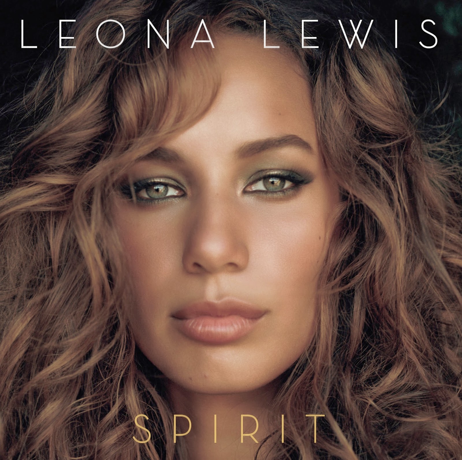 she walked into a store and saw that it would stand out to her and that she would be interested about who the artist was and be enticed to take a closer look. In reference to the front cover she said 'it's just a face, it's like look at my face' this was my overall intention for the front cover, the main reason for any front cover and album is to provoke sales which is why I went for the most appealing look I could find in the hope that it would entice sales. The first participant then mentioned that it very similar to Leona Lewis' 'Spirit' album. Leona Lewis' album front cover features a close up shot of her face. The frame is taken up by her face and her hair that is very large. The text is practically identical to mine in regards to placing. Her name is at the top and the album name at the bottom. Both of these are present on my front cover also. I had not seen this front cover before I planned my ancillary texts, however this does prove that my digi-pak is linked to conventions of the genre that I have chosen. Jacob, the only male in the group mentioned that he thought that the UK tour dates at the bottom of the magazine advertisement should be larger and more visible as it is difficult to see them as of now. I agree with this, when I was in the editing stage of the advertisement the tour dates looked very visible and rather large, but looking back now on the final product I can see what he means. If I was to re-do the advertisement I would make the UK tour dates much larger so they can be seen easily.
I was finding their suggestions on improvements very helpful so I decided to ask them one final question 'If there was anything you could change anything in any text, what would they be and why?'. The first participant to answer was Hollie. She repeated some of the points that had already been suggested in earlier questions of the focus group (the tour dates on the magazine advertisements should be made more visible, she doesn't understand why the artist is in the bath within the music video and she thinks I should make the image on the magazine advertisement coloured). Hermione then suggested making it clear from the very beginning that the character has a split personality. I agree with this and I would aim to make it clear from the opening and throughout that there is a split personality if I was to do it again. Charlotte then backed up my reasoning for making the main background image of the magazine advertisement greyscale by saying that she understands that the greyscale image links to the music video and has a good combination. Jacob then suggested that the 'OUT 14/04/14' text on the magazine advertisement should be a different colour as it is difficult to see the text with the black and white background. I agree with this as looking back now I struggle to see the text, similar to the UK tour dates situation, in editing it was clear to see the text. If I had the opportunity to re-do it, I would have it in a different colour.
Tuesday 8 April 2014
Evaluation Question 2-How effective is the combination of your main product and ancillary texts?
Whilst I was researching the conventions of media texts within my selected music genre, I noticed that all
aspects of the marketing campaign for that album and/or single were linked in one way or another. The music video would have elements of what the digi-pak had in it and the same with any advertising campaigns they may publish, including magazine advertisements. Since this was a common convention within professional media texts I realised it would be a good idea for me to do this myself within my main and ancillary texts.


I decided to conduct a focus group in order to see if people within my target market understood and recognised the links between all three texts. I was rather pleased with the response I received from this focus group. When I asked 'How do you think the texts link together?' they responded postively saying that they think they link together well through the images and the themes that are displayed across all texts. Jacob, a member of the focus group mentioned that perhaps to improve it I could make the main background image in the magazine advertisement not greyscale and replace it with the colour version of the photograph in order to make it link more directly to the digi-pak, the other members of the focus groups then agreed with this suggestion. I think this is a fair comment, and he is making a good point when he suggests it. However, I do feel that the existence of the greyscale filter on the image makes a direct link with the music video, so I feel the image being in black and white is justified. Another mentioned that she thought that the presence of the CD front cover was good and it brought all of the links together. She said that she would say that it makes the links complete between all three texts. I would agree with her point that adding the image of the front cover does link together the magazine advertisement and the digi-pak.
Overall, I think that I have successfully combined all three texts together. I think in all three products there are clear elements of the other texts within it. I think they're rather obvious also, especially in the font style and colours used in them. I do think however that it could be made even clearer. This could be done by using the 'Agency FB' font that is used in the magazine advertisement and digi-pak for the text at the beginning of the music video. I could also have used the locations that are used within the music video for the magazine advertisement and digi-pak so there is a clear link between all three products.
Monday 7 April 2014
Evaluation Question 1-In what ways does your media product use, develop or challenge forms and conventions of real media products?
The conventions that the music genre (electro-pop/dance pop)
I selected were a crucial aspect of the planning for my media products. During
my research into the conventions of the research for my music video project, I
recognised that the majority of the videos that fall under this genre tend to
go for the group, party and celebratory vibe with an energetic and happy mood
for the entire video. I wondered what it would the outcome would be if I
challenged these popular techniques and went for a different idea for my music
video. The song I had selected to create my music video for was Icona Pop’s ‘I
Love It’ which explains that the singers are simply not concerned and do not
care about their recent break up from their partner. Which prompted me to
attempt to twist the idea of this and question what would happen if this wasn’t
necessarily

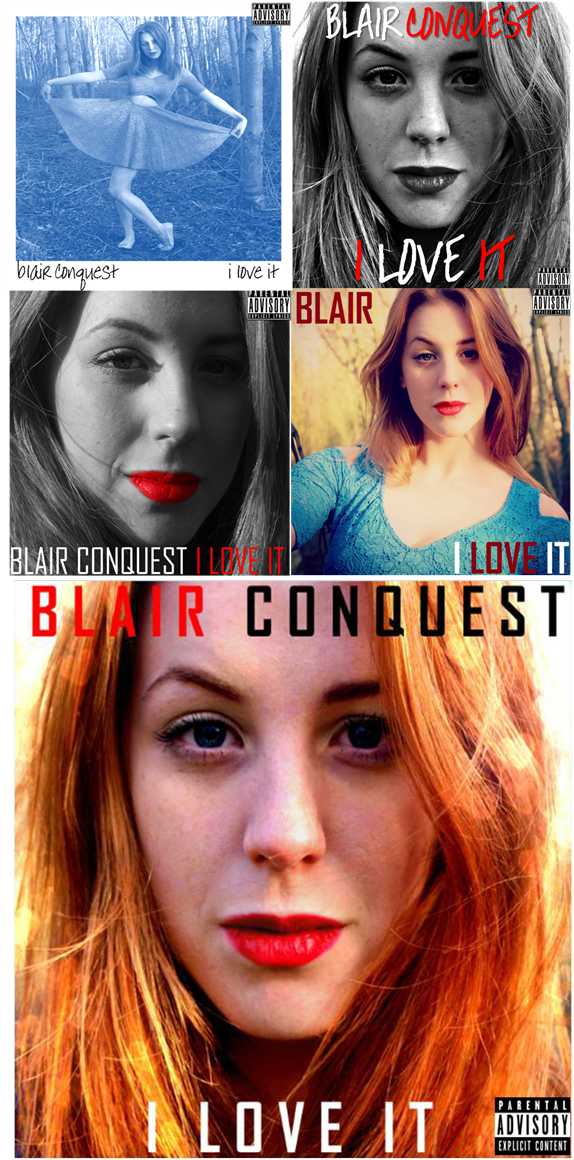 In regards to my album digi-pak. The conventions for digi-paks within this genre were generally very modern with close up or medium close up images on the front cover and modern (normally narrow) text for the album title and artist name. For the rest of the digi-pak, existing texts were similar to this and included medium close-up shots with sometimes the long shots. This is why for my ancillary texts I decided to incorporate these ideas as inspiration for my project. I began working on my drafts and attempted to include unique and modern editing techniques in regards to colour and styles, as shown on the right. The majority of the photographs that I took for the dig-pak were close up and medium close up shots to fit with the conventions that existing texts within the genre use. I aimed to use primary colours within my images as they would prove eye catching with the general public upon release to stores as well as fitting with the conventions of the genre the most suitably. I used a lot of red and white as they're both colours that are used in all three texts of my project to create links between them all. For the front cover and the back cover (for the track list) I experimented with different fonts that would suit the genre and the style that I was going for. In my final draft) I stuck with the colours that I had been going with all along-red and white. I then added black in there as it worked well with the image that I had decided to use. I eventually decided on the font 'Agency FB' as this would look the most modern out of all the fonts I was considering. The image I finally went for the in the front cover was a close up image that I took in a forest during the on location part of our photo shoot day. Then for the rest of the digi-pak the majority of the images were close ups and medium shots. The back cover was a medium shot of the artist in a forest, whilst the two disc holders in the digi-pak consisted of two halves of an image where the artist is laid on a bench, the lower half of her body is on one of the disc holders and the upper half on the other. I decided to do this as I saw this idea in an existing text within the music genre and it seemed like a clever idea. I am very happy with my final digi-pak, I think it looks quite professional within reason and is sticks very much to the conventions that I have research and follows well all my research findings.
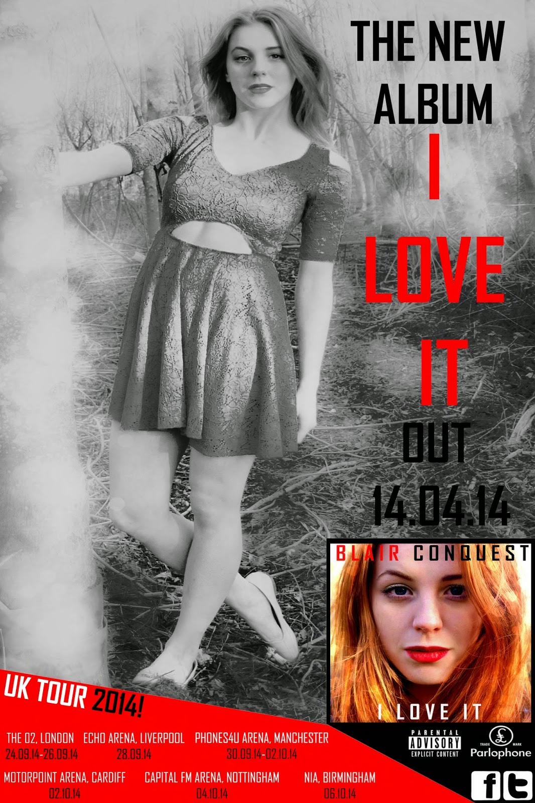 When I was researching professional media texts for the Magazine Advertisement I noticed that a lot of the texts included the album's front cover on the poster and incorporates it very much within the advertisement. I began looking into these ideas and how media texts of this style handle this and go about doing it. The majority of the advertisements had an image of the front cover at the bottom of the page. And normally used an image that was similar to the album artwork image in the poster, included the same font style within the poster that the album cover uses and the same with the colour. I began the process of creating my magazine advertisement for my album and completed numerous drafts. When I had completed my final first draft, I was not satisfied with it at all, to me it seemed a little unprofessional and rather amateur. I then decided to refer back to some other existing texts to try and gain some more inspiration for my product. I eventually came across some texts that heavily influenced me. One existing product had the background image filtered in black and white with the text in a contrasting colour to make it stand out on top of it. I took inspiration from this and did this with my final product. Another included the UK tour dates of the artist at the bottom of the advertisement. I had not seen this before during my research and it stood out to me as an interesting idea. I decided to use both of these ideas in my final product as they were both clever and interesting techniques to include in my advertisement. In order to follow the conventions of the genre, I used the same font style that is in the digi-pak for all of the text in the magazine advertisement, as well as the same colours that I have used for the entire project. I am now reasonably happy with my final product of the magazine advertisement as I feel it relates very much to the conventions of my chosen music genre and looks more professional than my previous drafts.
Friday 4 April 2014


Thursday 3 April 2014


Wednesday 2 April 2014
Feedback from Teachers for my First Drafts.
My first and only progress check was what I thought reasonably successful. I was given a few comments and suggestions as to what I could alter or keep the same for my final drafts of my media texts in which I intend to use take advantage of.
MUSIC VIDEO:
My teacher suggested that I need to include more close up shots into my video, she said at the moment there are too many long and medium shots so I'm firstly not using the conventions of the genre and secondly I am not showing enough range of editing skills which is required.
She also mentioned that I need to show more evidence of split personality to reference the idea of there being two characters in one. At that point there it looked a little like there was just one girl during the video and some black and white filters for no reason. I then decided to add some split screens (one side real 'inner self' and 'fake front') as well as choosing some footage showing her 'inner self' in an emotional way.
She also suggested that I should include 'flashing editing'. At that point there was some fast shots that matched the beats within the music, however it still was not as fast as desired. I then planned to make shots faster and keep the beats within the music matching the edits.
MUSIC DIGI-PAK:
The feedback for my digi-pak was generally very successful. My teacher only mentioned three things.
I need to add a bar code for the back of my album. He also mentioned that I need to add the record label logo and other album information on the back of the digi-pak to make it represent real media texts more accurately.
He also mentioned that I need to add spines into the digi-pak, I didn't do this before because I wasn't aware that this was required, I will design this for my final draft.
Apart from that he said that he liked the draft and that it was a very good attempt.
MAGAZINE ADVERTISEMENT:
There was quite a few suggestions for this part of my project. I wasn't full happy with this draft, for me it looked a little amateur-ish to me and I wasn't satisfied with it.
I need to add a Facebook and Twitter logo to the advertisement because nowadays artists include these logos in their marketing campaign to prompt fans to 'Like' and 'Follow' them on their social networking sites.
He told me to remove the 'BLAIR'S BACK' text on the advertisement as it didn't really suit it and it's not very relevant, luckily I wasn't very keen of this either.
He suggested that I should remove the 'OUT NOW' texts on it and replace it with a date as it's a bit of an easier substitute.
I need to lower the Parental Advisory warning as at the moment in it's current position (top left) is the first thing that you see at the moment which is not at all what is desired.
He suggested that perhaps I could blur the background around the artist to both show editing skills but also to add a nice effect and keep the focus on her.
I should add a few quotes from fake reviews on my advertisement as this is conventional of magazine advertisements within my genre.
Some Magazine Adverts I have found.

I like the black and white contrasts within this advert, it fits within the image. It also works very well with the text. The fonts are rather retro, tall and narrow which go within the genre of the music that is being advertised. The colours that the fonts are coloured with work well with the black and white background. Orange and White are used to make the font clearly seen and bond within the advert.

This magazine advert didn't inspire me from a design point of view. It was the suggestion that for an advertisement simplicity is effective. The advert is simply white with very basic black text featuring the artist name, the album title, the fact that that album is new and the release date-that is all. It suggests that a flashy, colourful advertisement isn't necessary. I won't be taking inspiration from this advertisement in regards to design, but I will bare in mind that I don't need to worry too much about making it so flashy.

I like this advert purely for the bottom of it. Towards the bottom of the advertisement there are details of Billy Bragg's UK tour dates, it features the venue information, dates and times. I think this is a very good idea and adds a new style to the advertisement. I would be tempted to use this as inspiration.
Friday 28 February 2014
Friday 14 February 2014

Final 1st Draft Dig-pak.
Digi-pak:

Front Cover:

Back Cover:

Back Left:

Inside Left:

Inside Centre Left:

Inside Centre Right:


Thursday 13 February 2014
Digi-pak 3.
Digi-pak:


Front Cover:
Back Cover:
Back Left:
Inside Left:
Inside Centre Left:
Inside Centre Right:
Subscribe to:
Posts (Atom)